

The branding for the law firm is built on a core belief: visual order reflects legal order. Every graphic element is designed to communicate structure, credibility, and discipline. The system avoids trends and unnecessary decoration, focusing instead on clarity, hierarchy, and timeless design principles that align with the seriousness of legal practice.
Brand Design Philosophy
The visual identity is guided by:
- Precision over ornamentation
- Structure over visual noise
- Elegance through restraint
- Confidence through simplicity
This approach ensures the firm presents itself as professional, trustworthy, and authoritative across all touchpoints.
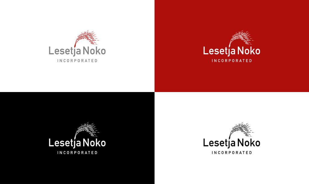
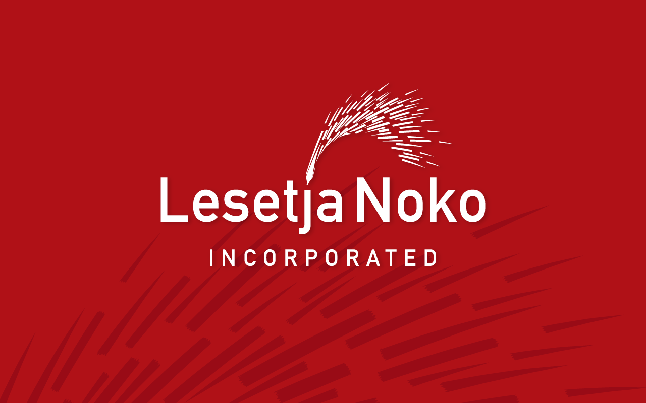
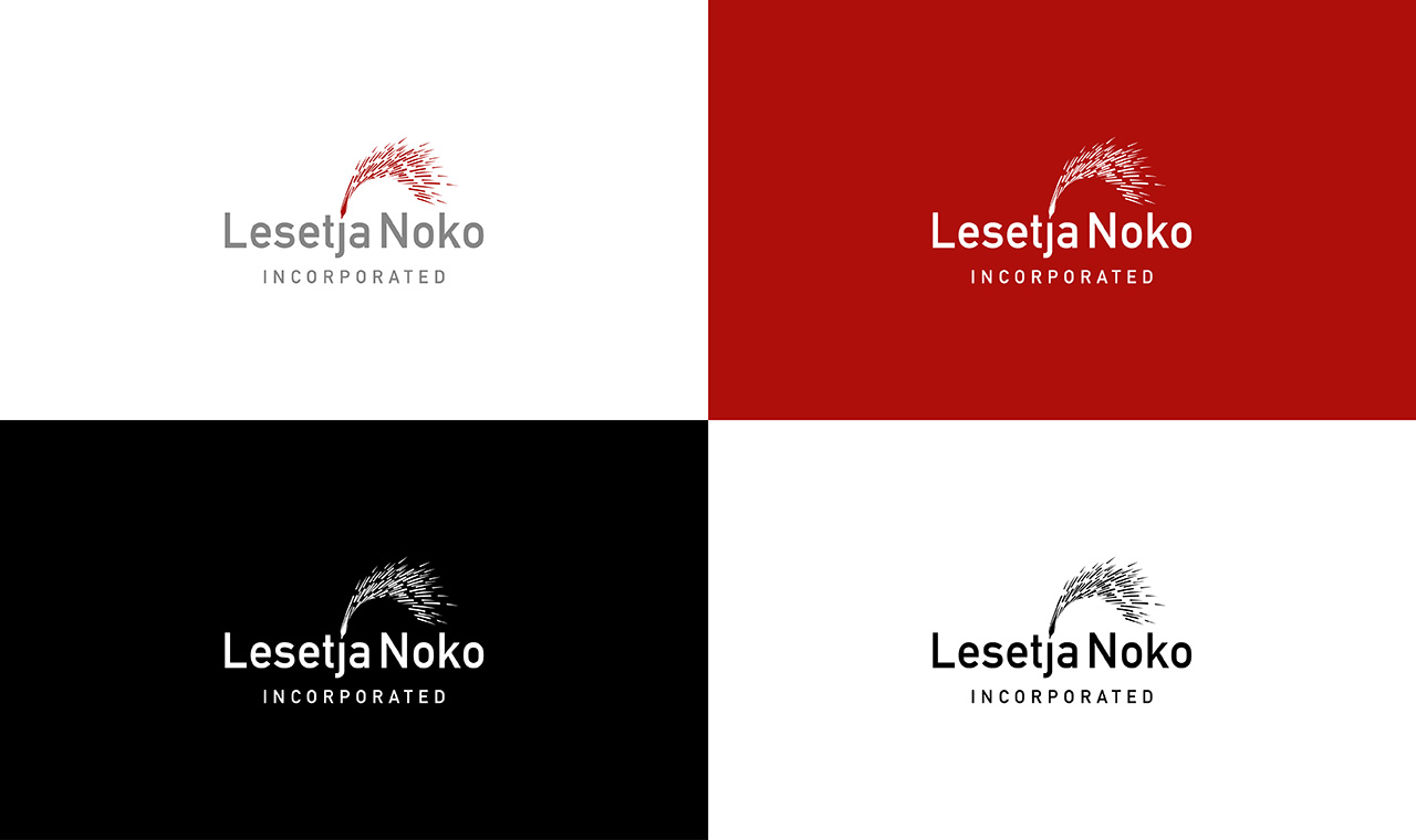
Logo & Identity Mark
The logo is crafted to be timeless and balanced.
- Clean, well-proportioned form
- Strong legibility at all sizes
- Suitable for both print and digital use
- Symbolizes stability, trust, and legal structure
Its simplicity allows it to sit comfortably on documents, signage, and digital platforms without overpowering the layout.
Typography System
Typography forms the backbone of the brand.
- A classic serif typeface communicates heritage, authority, and credibility
- A modern sans-serif typeface ensures clarity and contemporary readability
Clear hierarchy, disciplined alignment, and generous spacing create layouts that feel structured and easy to navigate.
Color Palette
The palette is refined and restrained to reflect professionalism.
- Deep navy, charcoal, or black for authority
- Neutral tones for balance and sophistication
- Subtle accent tones used sparingly for emphasis
This limited palette enhances consistency and reinforces a serious, premium presence.
Layout & Grid Structure
A strict grid system governs all compositions.
- Balanced margins and spacing
- Predictable alignment rules
- Intentional white space for a premium feel
This creates a sense of calm, order, and control across all materials.
Graphic Elements & Motifs
Instead of clichéd legal symbols, the design language uses:
- Lines and dividers
- Geometric balance
- Architectural references
- Subtle structural motifs
These elements communicate precision and professionalism without being literal.
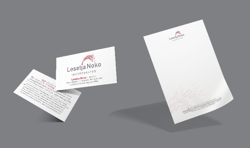
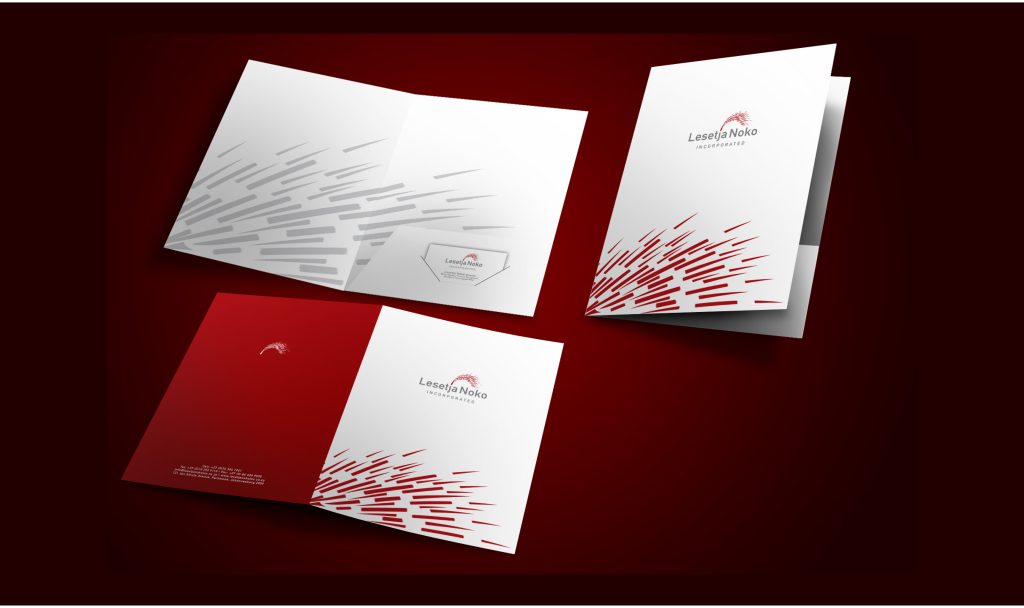
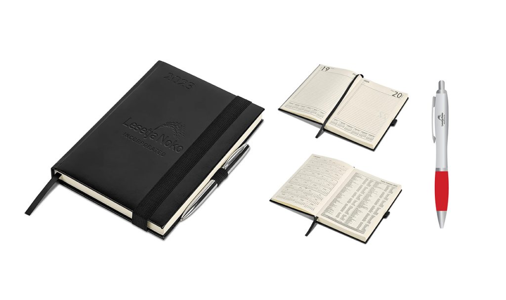
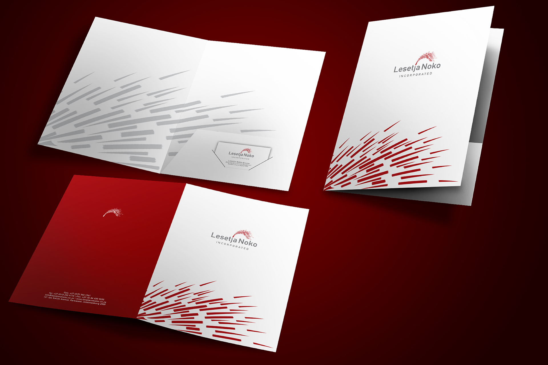
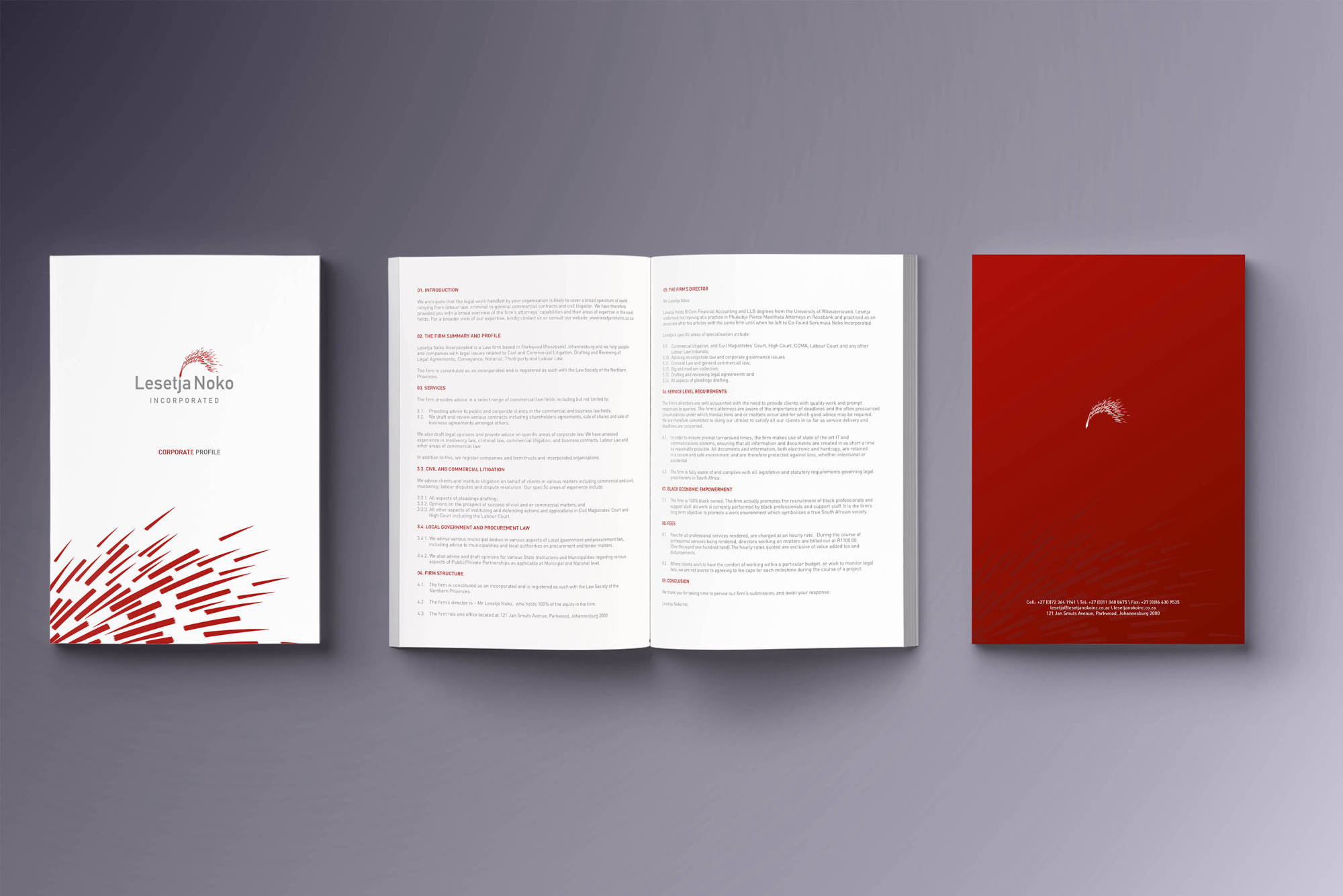
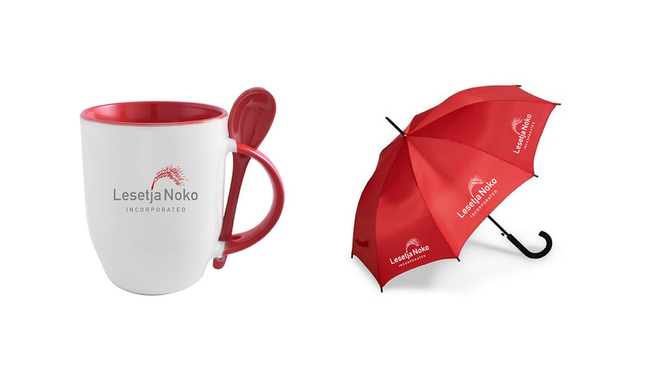
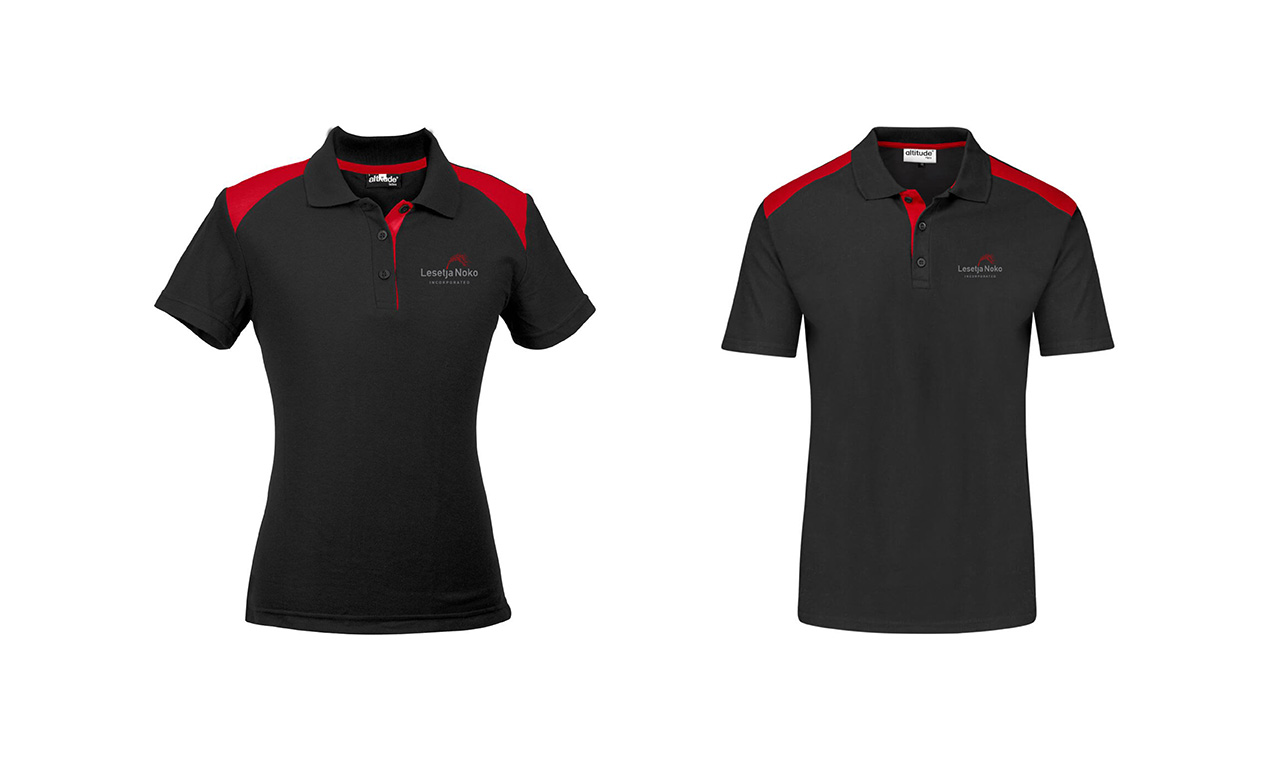
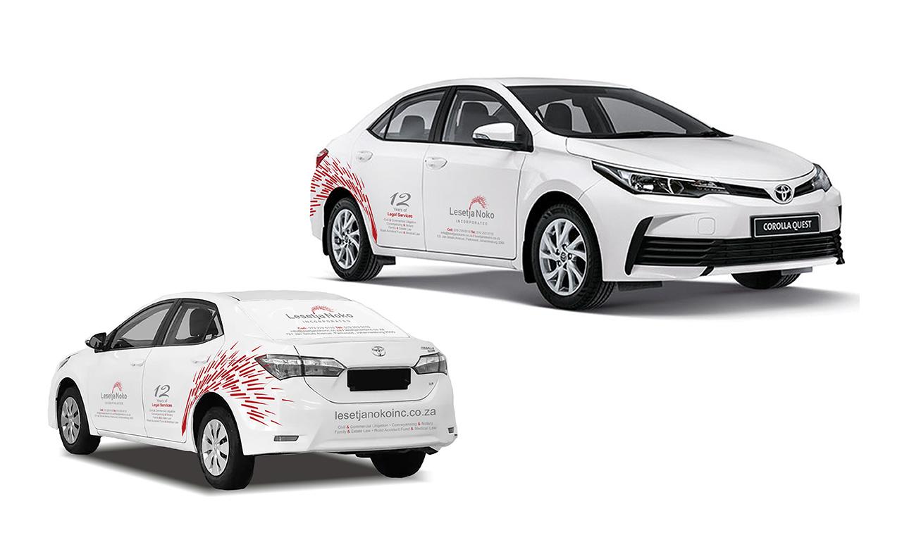
Applications Across Touchpoints
The branding system is designed to function seamlessly across:
- Stationery and legal documents
- Business cards and presentation folders
- Website and digital platforms
- Signage and environmental graphics
- Marketing and promotional materials
Consistency across these applications strengthens brand recognition and trust.
Design Tone
The overall graphic tone is:
- Confident
- Structured
- Refined
- Timeless
Nothing is excessive. Every element has a purpose.