

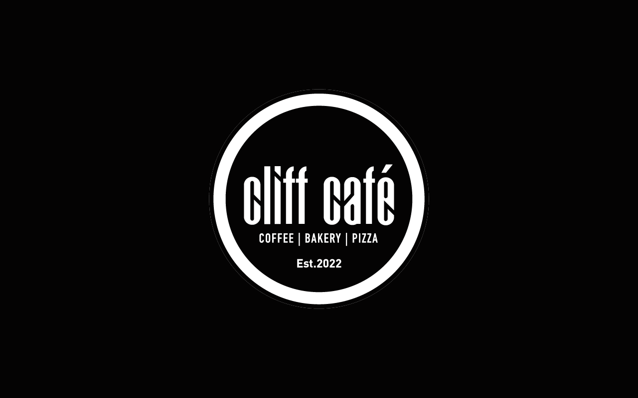
The café’s visual identity is built around a powerful constraint: black and white only. This deliberate limitation creates a brand that feels bold, timeless, and instantly recognizable. Without relying on color, the design communicates personality through typography, contrast, spacing, and material. The result is a brand that feels modern, artistic, and confidently minimal — much like the ritual of coffee itself.
Design Philosophy
The graphic approach follows a simple idea: clarity creates character.
By removing color from the equation, the brand leans heavily on:
- Strong typographic expression
- High contrast layouts
- Intentional white space
- Material and texture as visual elements
This makes every touchpoint feel curated and memorable.
Logo & Visual Presence
The logo is designed to be bold and highly legible in monochrome.
- Clean lines and balanced form
- Works seamlessly on black or white backgrounds
- Scales effectively across signage, packaging, and print
The mark becomes a stamp of identity that is unmistakable in any setting.
Typography as the Hero
With no color palette, typography becomes the primary design voice.
- A bold display typeface adds personality and café character
- A clean supporting typeface ensures readability for menus and information
- Consistent alignment and spacing create a structured visual rhythm
Type is used not just for reading, but for visual impact.
Black & White Contrast
Contrast is the defining design tool.
- Black backgrounds with white type for bold statements
- White space for elegance and breathing room
- Alternating compositions to create visual interest
This interplay creates a dynamic yet minimal visual system.
Stationery Design
Stationery becomes a tactile extension of the brand.
Business Cards
- Minimal layout with strong typographic focus
- Possible finishes like embossing or matte coating for refinement
Letterheads & Invoices
- Clean grid layout with generous margins
- Subtle logo placement
- Structured typographic hierarchy for clarity
Menu & In-Store Collateral
Menus, table cards, and posters follow the same monochrome discipline.
- Strong typographic layouts
- Minimal graphic elements
- Focus on readability and visual rhythm
This creates a cohesive in-store brand experience.
Packaging & Takeaway Materials
Coffee cups, sleeves, takeaway bags, and napkins become key brand carriers.
- Bold black logo on white cups or inverse applications
- Repetitive patterns or typographic compositions
- Clean, striking visuals that stand out without color
Materials & Print Finishes
With color removed, materials take center stage.
- Textured papers
- Matte finishes
- Kraft accents if needed within the monochrome range
These elements add depth and tactility to the brand.
Consistency Across Touchpoints
The black and white system ensures instant recognition across:
- Signage and storefront
- Stationery and print
- Packaging and takeaway items
- Social media and digital presence
The simplicity of the palette makes consistency effortless and powerful.